|
|
|
Lettering
|
|
The interlocking ôNYö logo of the New York Yankees, the Old English
ôDö of the Detroit Tigers, and the scripted ôDodgersö of Los Angeles are immediately recognizable design elements of the baseball uniform. They not only identify the club, but help define a marketable look. Above all, they
ôscreamö baseball. While some clubs have changed lettering styles over the years, and some continue to alter designs in their search for the perfect look, each team is trying to present a unique and immediately recognizable
design.
Initial InitialsIn the early days of baseball, most clubs wore uniforms with either no lettering or only a single letter. If a single character was displayed on a uniform, it was generally the first letter of the teamÆs host city or town, but team nicknames were also represented. Lettering styles varied from club to club, but a single letter in an Old English font was particularly popular during baseballÆs amateur era.
|
|
|
|
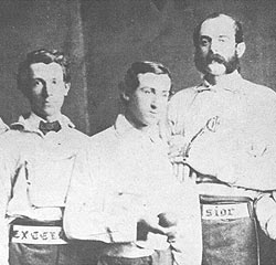
Belting It OutThe earliest known team to display a club nickname on their uniform was the 1860 Excelsiors of Brooklyn. Surprisingly, however, the nickname was not found on the cap or jersey, but on the team belt. The word ôEXCELSIORö in an Old English font was embossed on the belt so that the clubÆs name was proudly displayed across the front of the playerÆs waist. Other clubs in the 1860s followed this style, but by the mid-1870s the fad had passed. At left: John Whiting, Jim Creighton and Harry Polhemus of the Excelsior Base Ball Club of Brooklyn, 1860
|
|
|
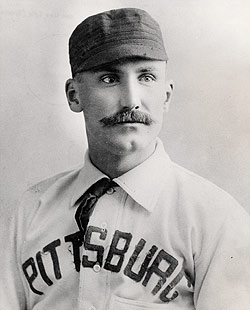
Pittsburg (not Pittsburgh)In 1890, the United States Board on Geographic Names dictated that the final ôhö should be removed from the names of all cities that end with ôburgh.ö Accordingly, ôPittsburghö became ôPittsburg.ö The ruling was not rigorously followed by city officials or baseball clubs. For example, the cityÆs National League club in 1895 wore ôPITTSBURGHö on the front of their jersey, while the 1894 jersey dropped the ôh.ö In 1911, following citizen protests, the ôhö was officially restored to the city name. At left: Jake Beckley of Pittsburg (not Pittsburgh), 1894
|
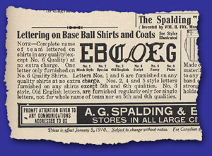
First in War, First in Peace, and First to Display Their NicknameThe first major league club of the 20th century to spell out their team nickname on their uniform was the 1905 Washington Nationals (later known as the Senators). The club wore the nickname ôNATIONALSö across the front of their jersey for two seasons, after which the club did not display a nickname until 1959, when their jerseys proudly displayed ôSenatorsö in script lettering with a flourish below. Though the new nickname was officially adopted prior to the 1957 season, both ôNationalsö and ôSenatorsö were interchangeably used throughout the clubÆs history. Bare CubsIt may be hard to imagine, but throughout the 19th century, many baseball clubs wore uniforms that bore no lettering or graphic imagery whatsoever. This was especially the case for home uniforms, as clubs could assume that fans knew which team was their own. By the turn of the century, however, blank uniforms were a rarity, and in the modern day world of baseball marketing, itÆs a sure thing that featureless uniforms are gone for good. The last club to don a blank uniform was the 1905 Chicago Cubs. That season the Cubs wore white jerseys, white pants, dark blue stockings and dark blue caps.Fancy Fonts for FreeBy 1910, Spalding was advertising six different lettering styles, generally available free of charge when purchasing baseball uniforms. Many major league clubs were using these lettering styles at the time: |
|
|
|
At left: Advertisement for lettering styles in SpaldingÆs Official Metropolitan Base Ball Book of 1910
|
Vertical VariationsWith rare exception, lettering on baseball uniforms is a horizontal or slightly angled affair. However, starting in 1909 and lasting for half-a-dozen years, a number of clubs dabbled with vertical displays of text on their buttoned placket.
We Are the ChampionsHall of Fame manager John McGraw was not shy. Following the clubÆs decisive victory in the 1905 World Series, he unashamedly dressed his 1906 New York Giants in uniforms emblazoned with the words ôWORLDÆS CHAMPIONSö across the chest. As audacious as it sounds, the Giants were not the only big league club to express such braggadocio. In 1921, the Cleveland Indians donned jerseys with the words ôWORLDS CHAMPIONSö on the front, and in 1927 the St. Louis Cardinals displayed the words ôWORLD CHAMPIONSö on their jersey front. Each of these three clubs failed to return to the World Series in the seasons in which their uniforms boldly displayed their championship status, and perhaps this is why the practice has never returned.
|
|
|
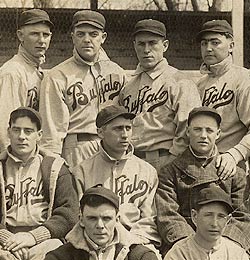
Equipped with ScriptWhen one thinks of the quintessential baseball uniform, it is often adorned with a team or city name angled across the shirt front in script lettering. The first big league club to use this design was the 1914 Federal League Buffalo Blues (also known as the Buffeds). It was not until 1930 that the script lettering was reintroduced into big league baseball. In that year, the Detroit Tigers adopted the style that has since been embraced by nearly every major league club at some time during its history. The earliest known use of script lettering on any professional team uniform is 1902, when the style was used by both Oakland and San Francisco of the California League. At left: Members of the 1914 Federal League Buffalo Blues
|
Trials with Styles That Lasted a WhileSome baseball clubs are closely identified with their lettering style. The interlocking ôNYö of the Yankees and the word ôCardinalsö hanging on the familiar birds-on-a-bat graphic are examples of styles that have long been associated with baseball clubs. However, when these designs were first used, it wasnÆt certain that they would last. Who knows what new designs of today will one day be looked upon as baseball classics? The following is a list of the first time that well-known lettering styles were used on the uniforms of a number of major league clubs.
|
|
|
Dressed to the Nines: A History of the Baseball Uniform |
|